Instagram, the photo sharing app owned by Facebook, responsible for such cultural highlights as hot-dog legs, The Fat Jewish memes and Rich Kids of, well, Instagram, has debuted a new logo.
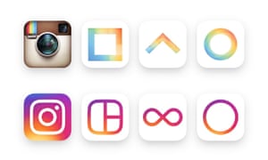
The previous one, a retro-looking camera, and one of the most recognisable tech logos out there, has been replaced by a background swirl of sunset colours (orange, yellow, pink, purple) and a white outline of a camera. As if the camera was murdered, and chalk was drawn around its body. Murdered at sundown. Here it is:
The new logo was announced via a blog post, a longer post on Medium from head of design, Ian Spalter, and also a short introductory film. The kind that is usually intensely annoying, but actually this one is quite cute (warning though: the end has a lot of flashing and intense colours).
The blog post asserts that the “Instagram community has evolved over the past five years from a place to share filtered photos to so much more – a global community of interests sharing more than 80m photos and videos every day. Our updated look reflects how vibrant and diverse your storytelling has become.”
Opinion on social media from Instagram users is split. Some are on the fence:
No hay comentarios:
Publicar un comentario